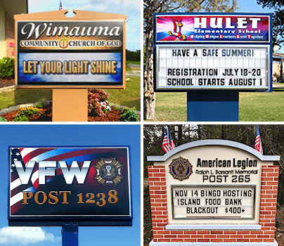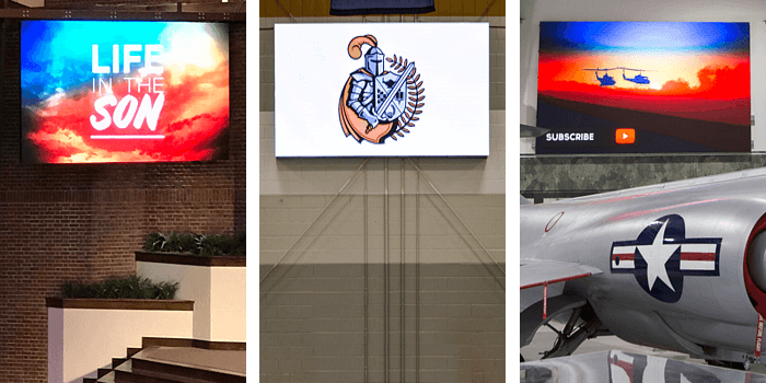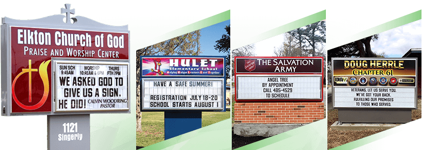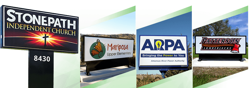
LED is the wave of the future - and it's here now. This eye-catching way of communicating with your community invites people's attention directly to your messages, enabling passersby to learn about your church, school, or organization in ways that previously simply didn't exist. Before LED signs dominated outdoor advertising spaces, organizations had to exhaust their budget on marketing collateral, print mailers, and other old-school forms of messaging that may or may not have had a positive ROI.
LED signs eliminate the cumbersome work of marketing by taking your messages straight to the people who are most likely to be impacted by your statements. Unfortunately, when done wrong, your LED efforts can backfire in major ways, unintentionally going viral on social media as an example of a sign that should never have been erected, or worse, damaging your reputation as a worthy organization.
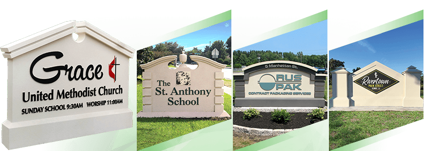
Fortunately, we're on your side! Our team has been helping our customers create signs and find the right words for five decades. With all that experience under our belts, we've come across a few customer-facing conundrums that could have been avoided. In honor of this, we'd like to share our top LED messaging mistakes you don't want to make!
1. Poor Grammar and Spelling
This is mistake #1 on our list for a good reason: poor spelling and grammar reflect poorly on the organization the sign is representing. You may not be a pro, and that's totally okay. Make sure you run your message through two or three people before you hit the magic button that displays your words to the world. Sometimes, a set of fresh eyes will catch errors you didn't even notice.
2. Lettering That's Too Small to Read
Your goal is to get people to read what you have to say and engage with your content. If your lettering is too small, all of your efforts are in vain. There's a bit of science behind the sizing of fonts when you're creating LED messaging; lettering that's too small won't be legible from far away, and people aren't going to go out of their way to see what you have to say. It's important to make lettering large enough so it can be read by people driving by in their cars or by people walking past your place from a fair distance. If you feel like you have to make your letters small to get your point across, your message may be overly wordy.
3. Being Overly Wordy
You have a lot of awesome things to say about your organization. After all, you've put a lot of work into making it what it is today. Instead of shooting your organization's entire history up on the display board, think about the message that's most relevant at this particular place and time. Remember, with LED signs, you can easily adjust and change your signage as you see fit. If you're not able to knock your content down to a more palatable amount of words, consider asking for a second or third opinion. Another person may be able to help you capture the essence of your message in a more concise manner.
4. Unfunny Humor
Before you go bold with a statement that makes you split your sides in hilarity, test the message on a few of your colleagues, customers, or members of your congregation. Out-of-the-box humor can do incredible things to boost your brand's awareness, but if it comes across as crass to others, you'll be doing your organization an injustice. By testing your message with a few audience members before your message hits center stage, you can combat many unforeseen catastrophes that may have otherwise found themselves right at your front door. Remember to listen to the advice of the people you run your messages by. Chances are, if they're telling you a message isn't as funny as you perceive it to be, it's probably not. Go back to the drawing board if anyone sends a red flag that others may be offended by the words you put on your sign.
5. Confusing Content
Your content needs to be relevant to your organization. Sure, you might be offering promos or endorsing seasonal events, and you can capture that within the words of your content. But if you're just putting things on your sign that are off-kilter, you'll likely kill your audience's attention.
6. Malfunctioning Signage
We've all seen those retail stores' signs that spell something irrelevant when the sun goes down because some of their lettering has lost its shine. Although LED signs can't quite experience the same downfall, a damaged sign can diminish your overall brand. Damaged LED boards or malfunctions will often send your audience one specific signal: you don't care enough about your organization to put your best foot forward. If something on your signage isn't working properly, be sure to replace or repair it right away.
7. Poorly Placed Signage
It doesn't matter how beautiful your sign is or how much thought you put into your message — if the display is invisible to passersby, all your effort was for naught. Before you put your sign up, take a good, hard look at the surrounding landscape. Are there tree branches that will block your audience's view? Are there certain zoning restrictions you may not have taken into account? Is your sign too small for the space you're trying to advertise in? Most poor-placement situations can be remedied with some careful forethought. Just be sure to enlist the assistance of experts before you really get going!
When you're using an LED sign, cloud-based software like SignCommand is the way to go. With this technology, you can easily make changes to your message. Set your message, take a look, and if something's not right, you can quickly revise the wording on your display. Don't you wish every mistake was that easy to correct? Have questions about digital signage? Contact us today. We can help.